
Editorial design · Corporate brochure · Branding

Desentop

Desentop · Assista Group · Lisbon, Portugal

An institutional editorial brochure that translated more than 30 years of technical expertise in sanitation and drainage services into a clear, coherent and commercially effective visual narrative.

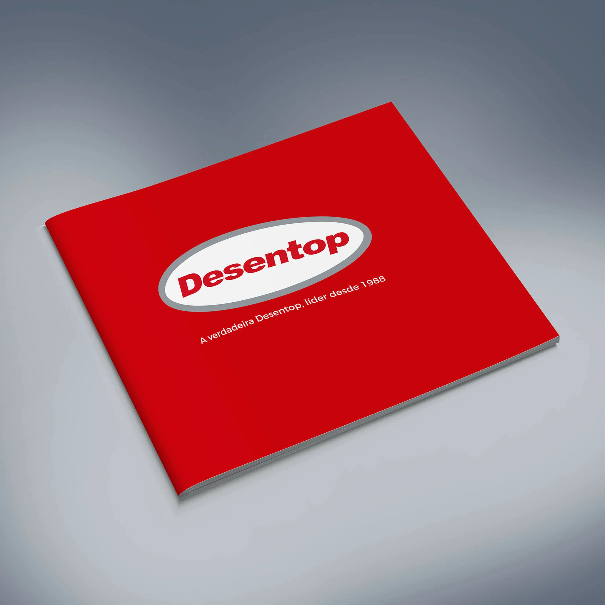
Desentop institutional brochure cover
The project

Desentop is part of the Spanish Assista Group and is based in Lisbon. Its work ranges from domestic unblocking and sanitation services to complex solutions for industrial facilities, institutions and companies operating in national and international markets. The communication challenge was to present this breadth of capability in a format that conveyed technical authority without becoming dense or difficult to navigate.

The brochure was therefore designed as a modular editorial system rather than a conventional service catalogue. Art direction used Desentop’s red brand colour as an active recognition and navigation device, balanced by neutral greys, generous negative space and controlled contrast. A flexible grid organises headings, service descriptions, photography, client references and institutional messages through a consistent rhythm and hierarchy.

The final piece works simultaneously as a corporate profile and a sales enablement tool. Its visual architecture allows readers to understand the company’s services, sectors, market presence and operational experience quickly, while presenting Desentop as an organised, mature and technically credible partner.
Visual system

Extending the brand identity into an editorial system.

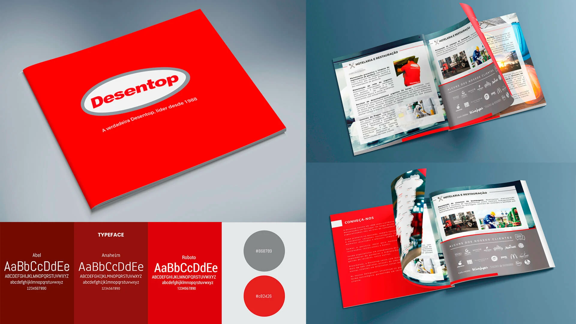
Colour, typography, image treatment and layout rules were consolidated into a flexible design logic capable of supporting concise statements, technical descriptions and image-led spreads without losing visual recognition.

Desentop brochure art direction, typography and colour system
Modular gridA reusable structure for services, proof points and institutional content.
Type hierarchyClear levels for scanning, detailed reading and commercial emphasis.
Brand continuityRed, grey and white create recognition across every spread.
Production readinessLayouts prepared for consistent print reproduction and finishing.
Information architecture

A modular grid makes complex information easier to decode.

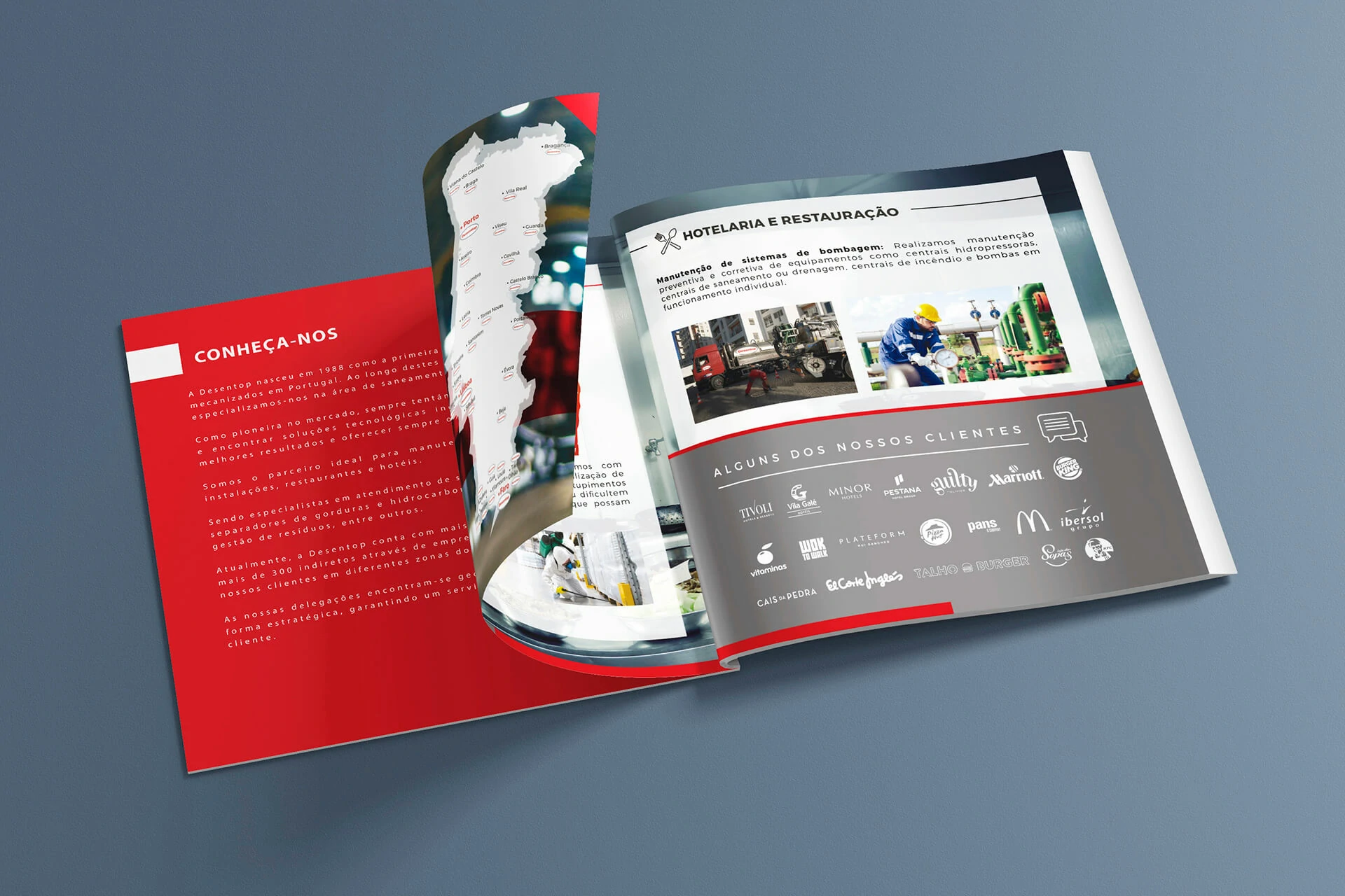
Content was divided into clear levels with consistent zones for headlines, body copy, photography, service categories and supporting evidence. Variations in column width and image scale create movement, while recurring rules and colour blocks maintain orientation throughout the publication.

Desentop brochure spread showing services, company presentation and client references
Commercial communication

Editorial rhythm designed to support commercial conversations.

The alternation between informative, visual and evidence-led spreads gives the brochure a controlled pace. Client logos, geographic coverage, sectors and technical services are integrated as proof points that strengthen sales discussions without overwhelming the reader.

Desentop editorial brochure layout for hospitality, maintenance and industrial services
