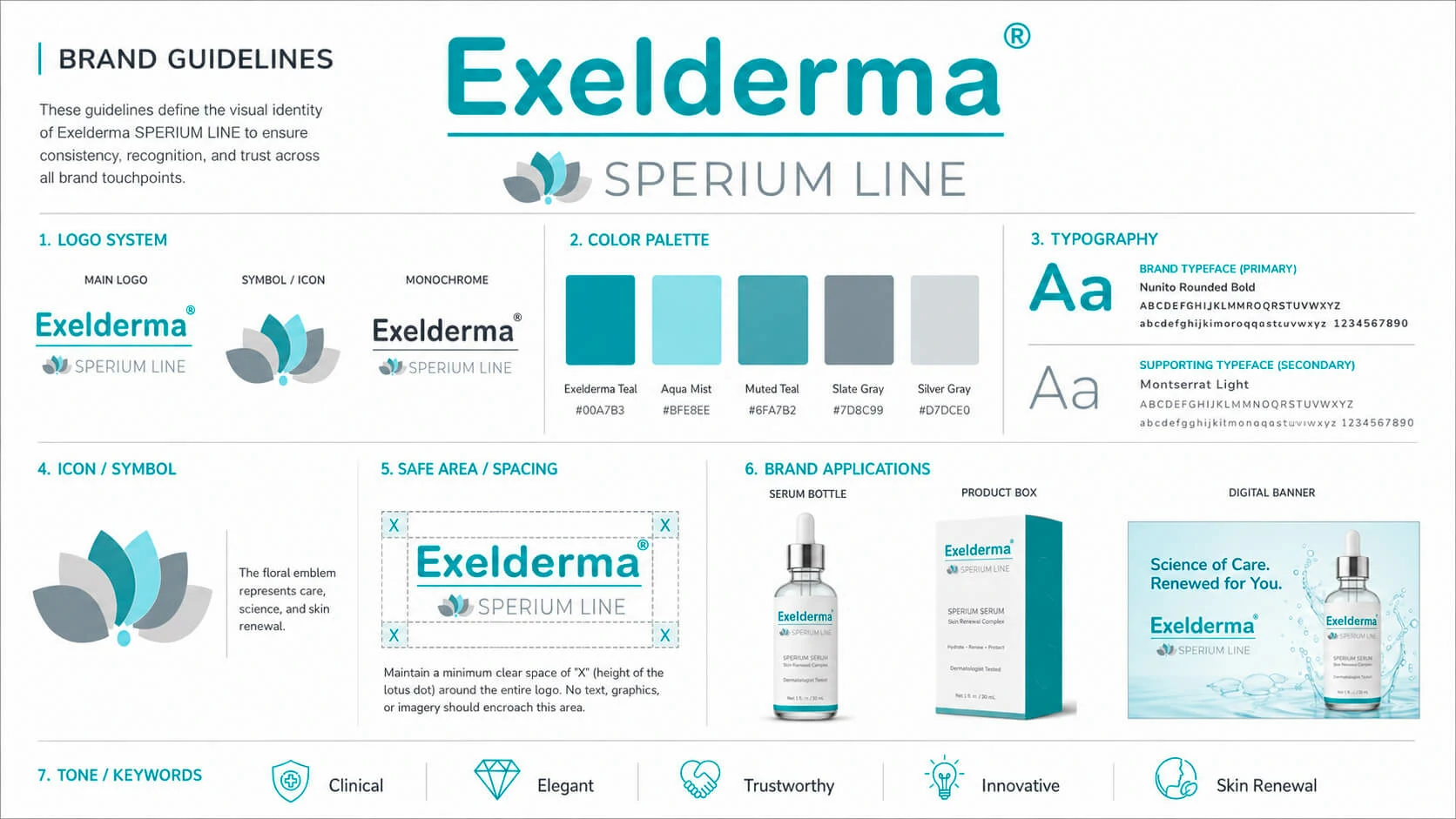
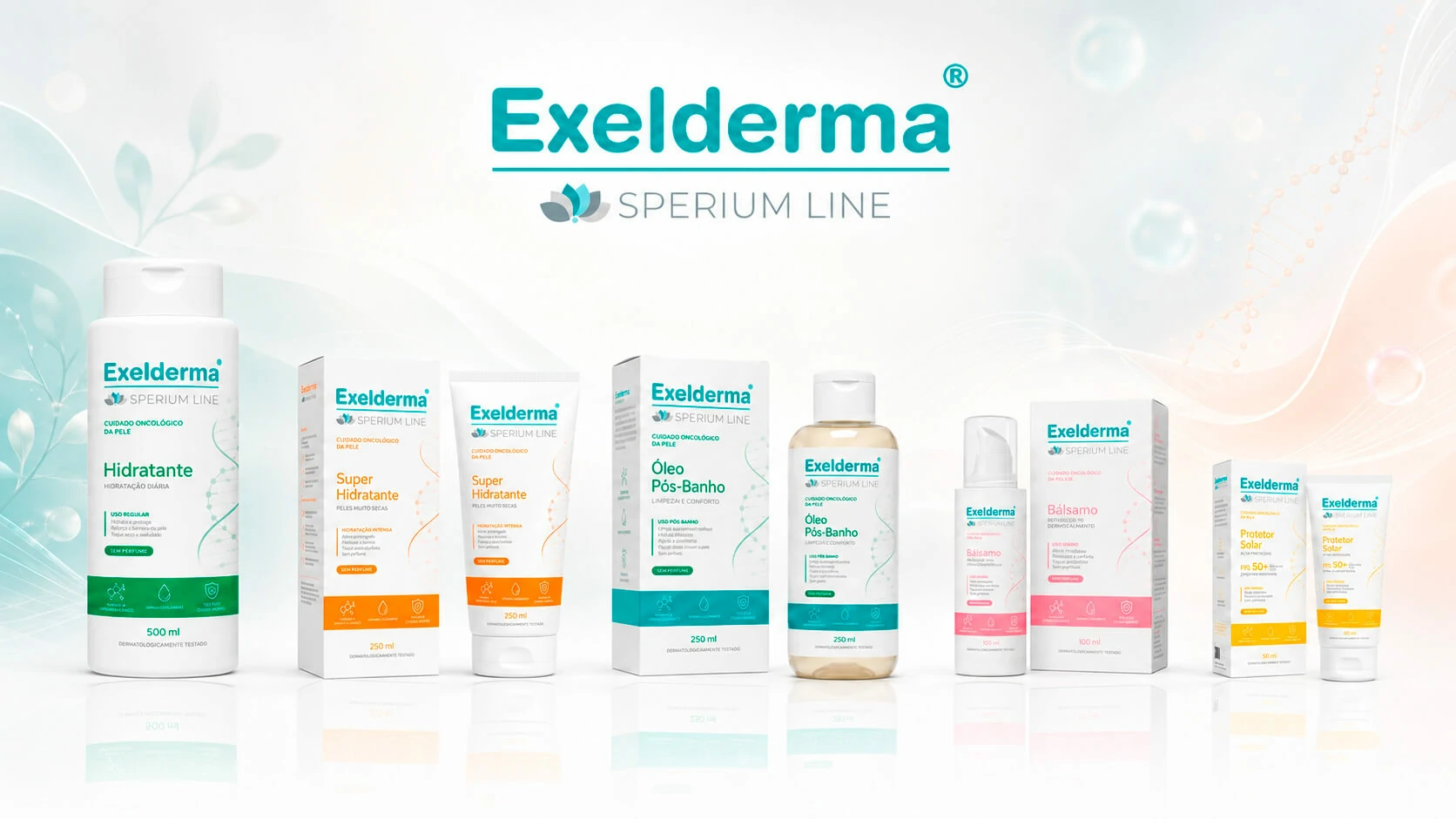
Sperium Line was envisioned as a future product range focused on delicate skin care in a highly sensitive physical and emotional context. The central design challenge was to create a visual language capable of communicating safety, dermatological credibility and functional clarity without appearing excessively medical, cold or impersonal.
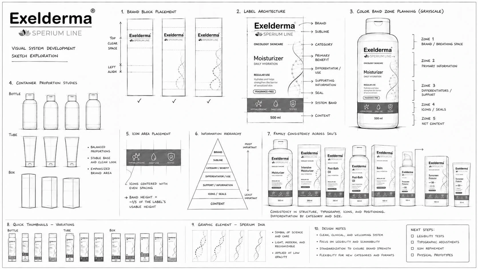
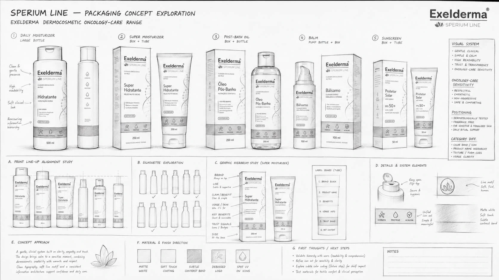
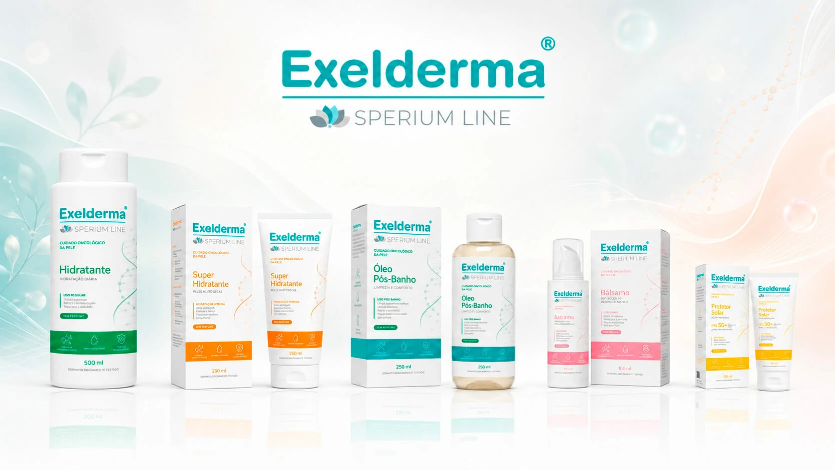
The development process began with the creation of a shared visual architecture for the entire range. Brand, subline, product name, primary benefit, directions for use, key information and supporting technical content were organised into a consistent hierarchy so labels could be read quickly and intuitively across bottles, tubes, pump dispensers and cartons. A predominantly white base was paired with soft category colours to distinguish the products while preserving family coherence.
Organic graphic elements were introduced to suggest softness, balance and skin renewal, while modular typography and clearly defined label zones reinforced precision and scalability. The conceptual line includes Daily Moisturizer, Intensive Moisturizer for Very Dry Skin, Post-Shower Oil, Intensive Care Balm and SPF 50+ Sunscreen. Beyond the visual composition, the project also addressed readability across pack sizes, the organisation of mandatory information, SKU consistency, category differentiation and preparation for future line extensions. As the products are still under research, validation and approval, the visuals shown represent a conceptual packaging direction rather than a range currently available on the market.