Brand identity · Wine label · Packaging

O Viking

Private tribute project · Denmark / Brazil

A custom wine identity created as a personal tribute, translating strength, generosity and family memory into a symbolic brand and packaging system.

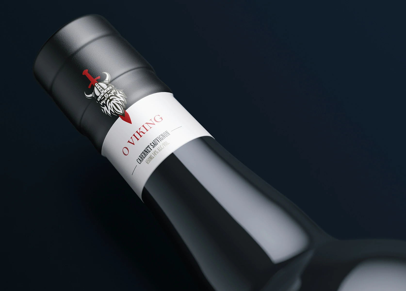
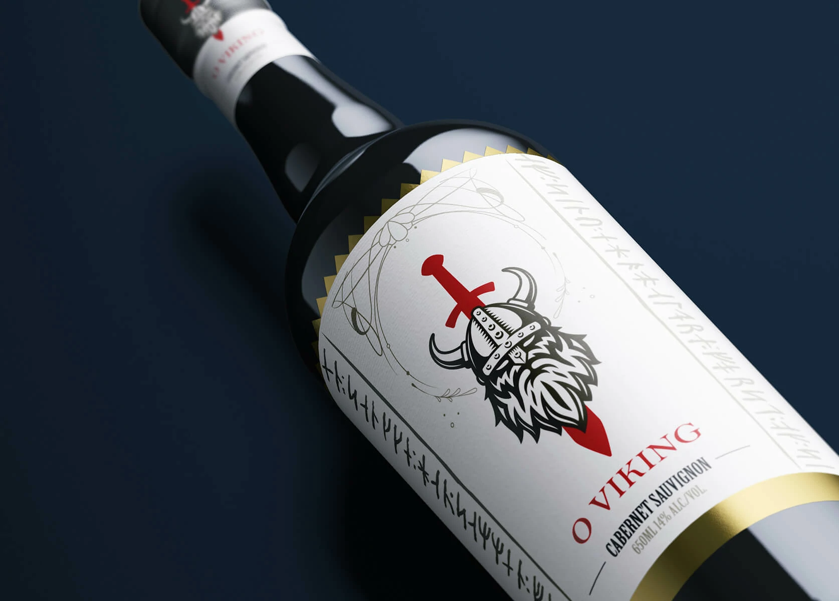
O Viking wine label close-up and bottle branding
The project

O Viking did not begin as a conventional wine brand. It began with a son’s wish to honour his father through an object that could be kept, shared and remembered. His Danish family, with close ties to Brazil, described him as a man with a commanding personality and an exceptionally generous heart. That contrast became the emotional centre of the project.

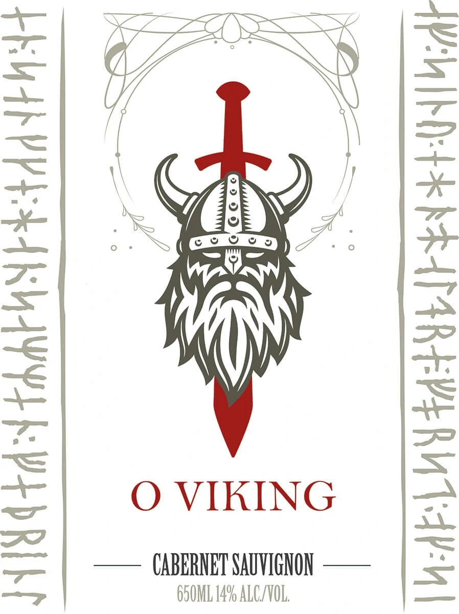
The identity was built around a custom Viking figure in which the face, beard, helmet and sword form one compact emblem. The sword creates a strong vertical axis, while Nordic-inspired inscriptions along the label edges add cultural character and reinforce a story of courage, resilience and legacy.

The result is a complete visual narrative, from logo construction and colour direction to typography, label design and realistic bottle mockups. Although the object is a bottle of wine, the design communicates something more personal: a bold and dignified tribute created to preserve the memory of the person behind it.
Concept development

A personality translated into a symbol.

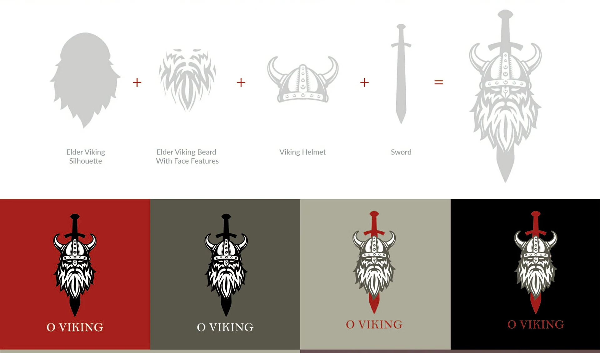
The mark combines the silhouette of an elder Viking, an expressive beard, a helmet and a sword. Each element was selected to communicate strength, dignity and protection without losing the human warmth behind the tribute.

O Viking emblem construction from beard, helmet and sword
Visual system

From visual references to a coherent identity.

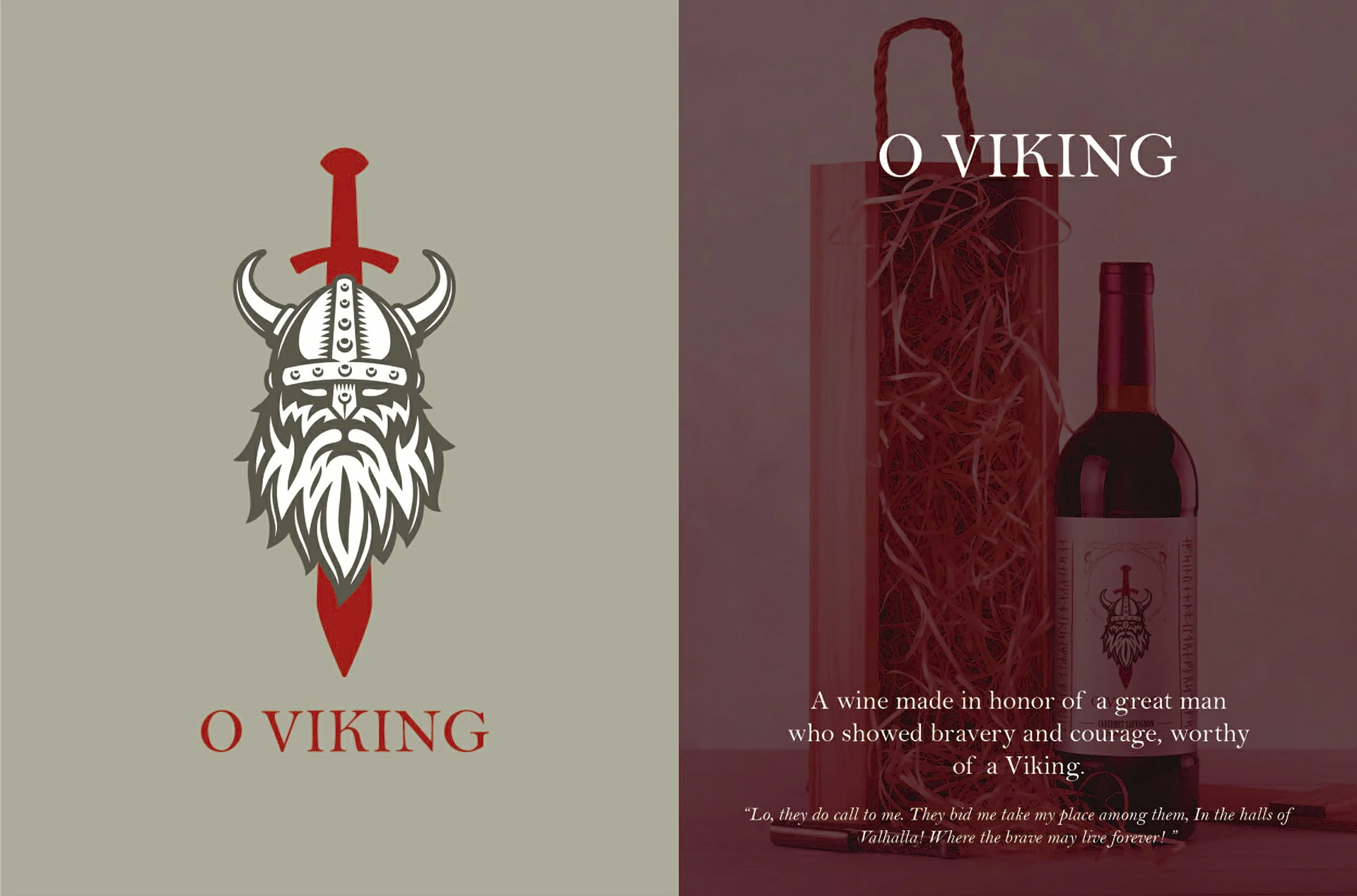
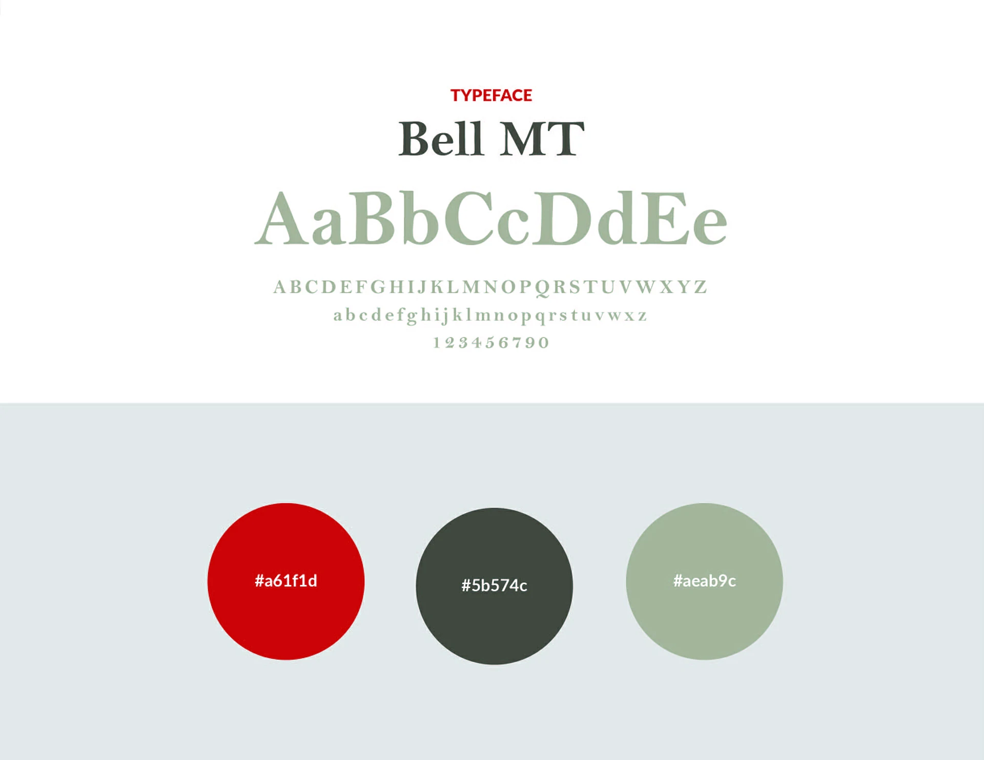
Construction studies show how the individual elements were simplified and unified into a recognisable emblem. Bell MT, a muted green-grey palette and a deep red accent create a classical yet personal wine identity.

O Viking typeface and colour palette
Label design

A label designed to carry the story.

The vertical composition places the emblem at the centre, while decorative lines and Nordic-inspired inscriptions frame the bottle. Cabernet Sauvignon information is integrated without competing with the emotional meaning of the tribute.

Packaging applications

From flat artwork to a believable product.

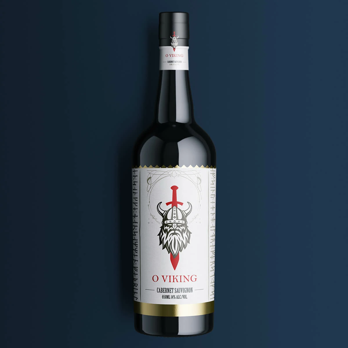
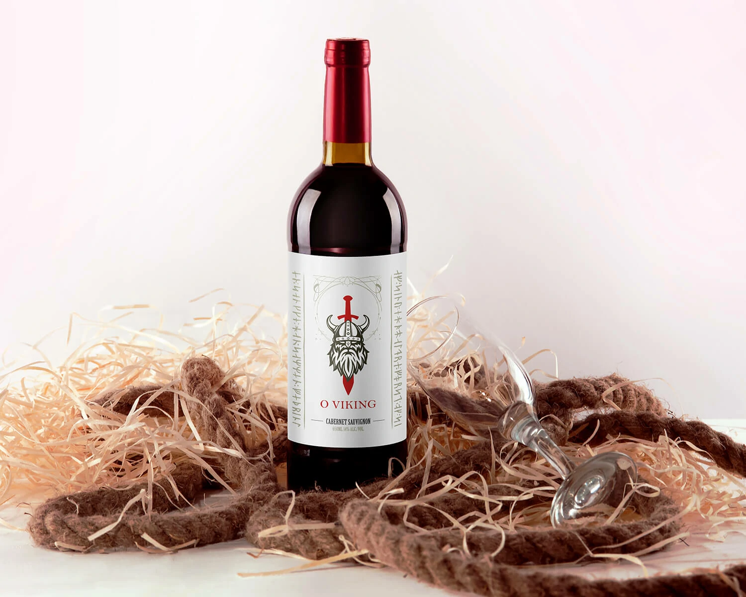
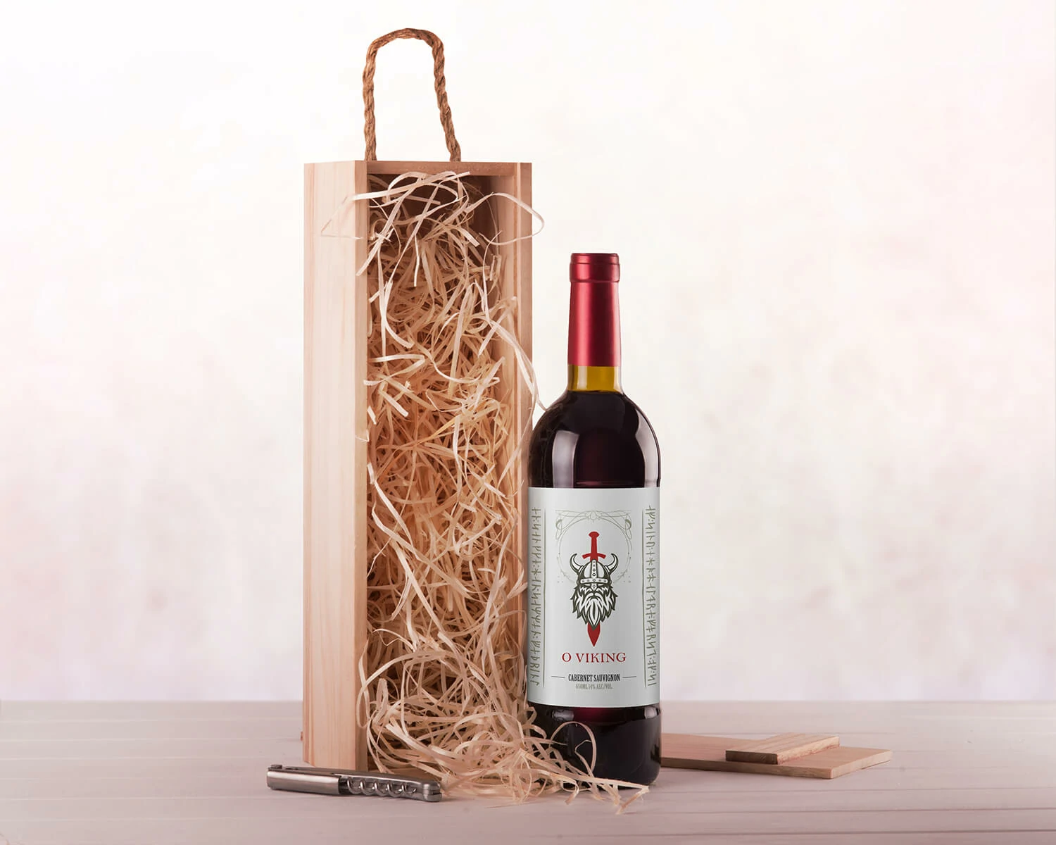
Photorealistic applications tested legibility, material presence and visual impact across dark studio scenes and lighter presentations featuring wooden packaging and a gift-oriented atmosphere.