
Branding · Industrial Identity · Mini Brand Guidelines

Tecshape

Tecshape · Sotecnisol Group · Lisbon, Portugal

A concise brand governance system translating metalworking expertise, precision engineering and production capability into a clear, contemporary industrial identity.

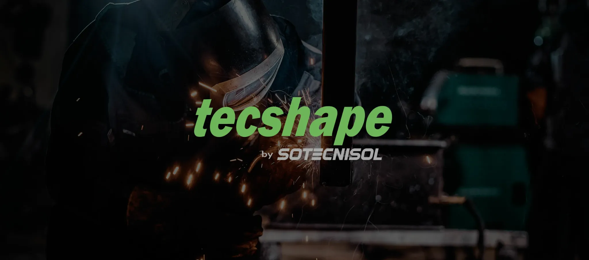
Tecshape industrial identity applied over a metalworking scene
The project

Tecshape is a Lisbon-based company within the Sotecnisol Group, specialised in customised metalworking solutions. Its work combines the practical knowledge of traditional metal fabrication with advanced processes, specialised equipment and high-precision technologies. The brand needed a visual system capable of expressing this combination without becoming either excessively mechanical or visually generic.

The identity was organised around the name itself. “Tec” establishes a direct connection with technology, technique and technical expertise, while “shape” refers to form, construction and the transformation of materials. This semantic structure gives the wordmark a clear strategic role: it explains how the company turns technical capability into functional, precise and durable outcomes.

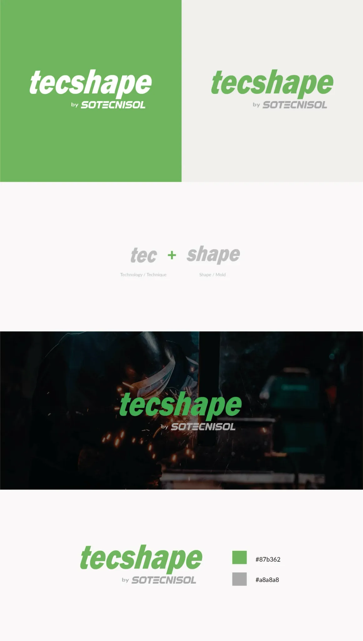
The mini brand guidelines consolidate the essential rules required for consistent use across corporate, commercial and digital touchpoints. Logo variations, colour behaviour, photographic applications and the conceptual construction of the name were documented in a deliberately concise format, creating a practical reference that can support future communication without adding unnecessary complexity.
Naming and concept

Technology gives the brand its method. Shape gives it purpose.

The name and wordmark were treated as one strategic unit. Forward-leaning typography communicates movement and production capability, while the clear verbal construction makes the company’s combination of technical expertise and material transformation immediately understandable.

TecTechnology, technique and specialist know-how.
ShapeForm, construction and material transformation.
Forward motionItalic letterforms suggest speed, productivity and execution.
Industrial clarityA direct wordmark remains legible across practical applications.
Visual identity

A direct visual language built for precision and production.

Bold italic typography introduces energy and direction without losing industrial credibility. Green acts as the primary recognition and differentiation colour, while grey connects the identity with metal, structural systems, engineering and operational solidity.

Tecshape mini brand guidelines with logo versions, naming concept, applications and colour palette
Mini brand guidelines

A compact guide that protects consistency without slowing the brand down.

The system prioritises the rules with the greatest practical impact: correct logo variants, contrast, colour use, background behaviour and conceptual continuity. The result is a usable reference for everyday production and future brand expansion.

RecognitionConsistent logo hierarchy and colour behaviour across every touchpoint.
FlexibilityVersions prepared for light, green, dark and photographic backgrounds.
GovernanceSimple rules reduce visual drift and production inconsistencies.
ScalabilityA focused system that can support future corporate and commercial materials.